The Publisher's Dashboard for Google Analytics
A free Google Data Studio (now Looker Studio) dashboard template that gives you everything you need to know about your site in 5 minutes

Answer Questions Like:
How are my website views trending in the last day, month or year?
What posts are getting the most traffic and where is the traffic coming from?
What content is bringing new visitors and what content is engaging repeat readers?
What email newsletters are engaging and connecting with subscribers?
Template Highlights
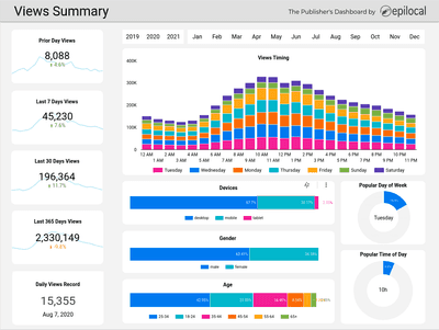
Views Summary
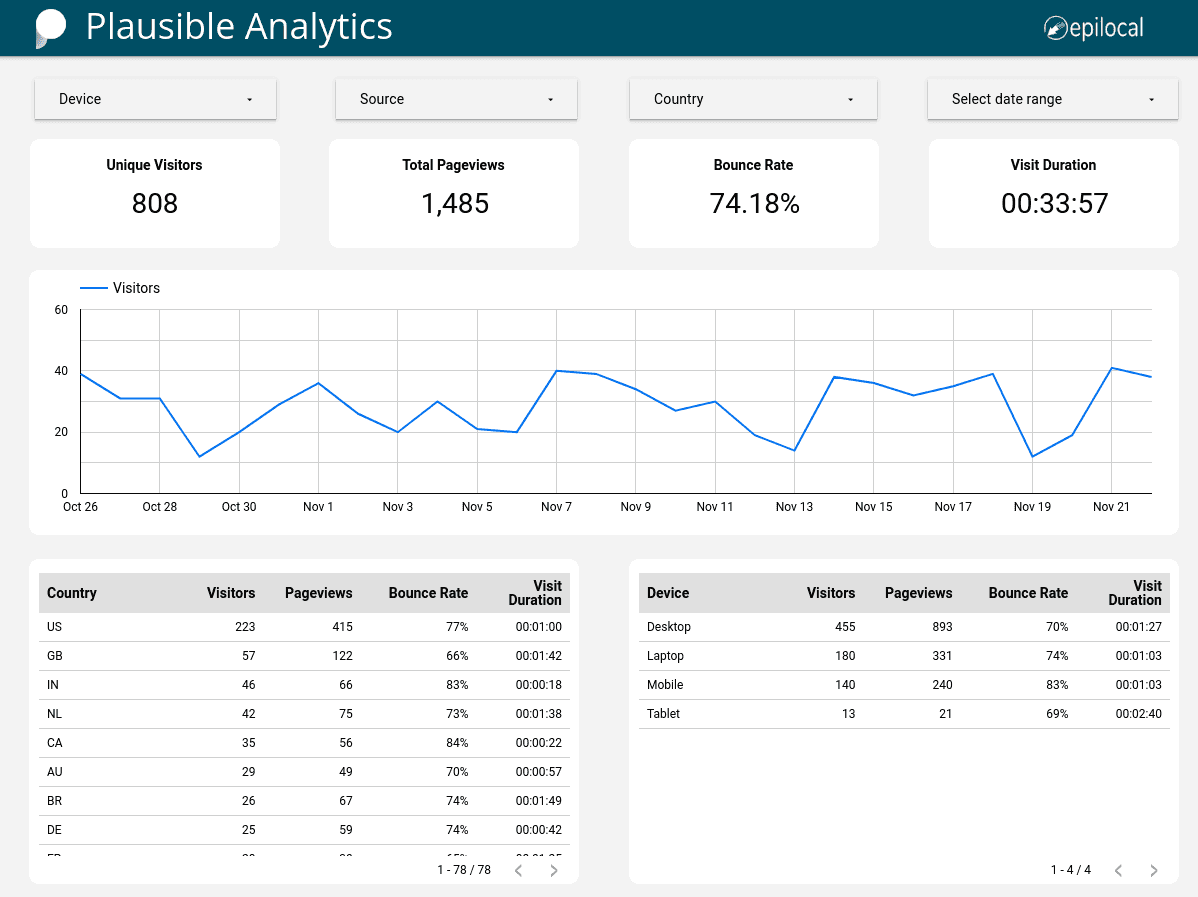
In one quick glance you can see how your website views are trending in the last day, week, month and year. Along with that, you can get a feel for the time of day and week that people visit your site along with demographics and information about the device they are using
Views Explorer
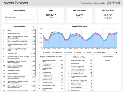
Drill deeper into how individual pieces of content perform as well as what channels are driving traffic to your site. In one view, you can see the top organic search terms, referral sites, and social media views, either for your site as a whole or for individual posts. All of this can be analyzed for any time-frame.
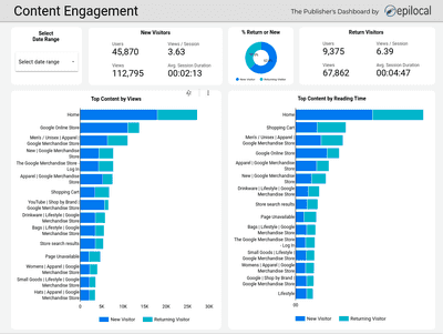
Content Engagement
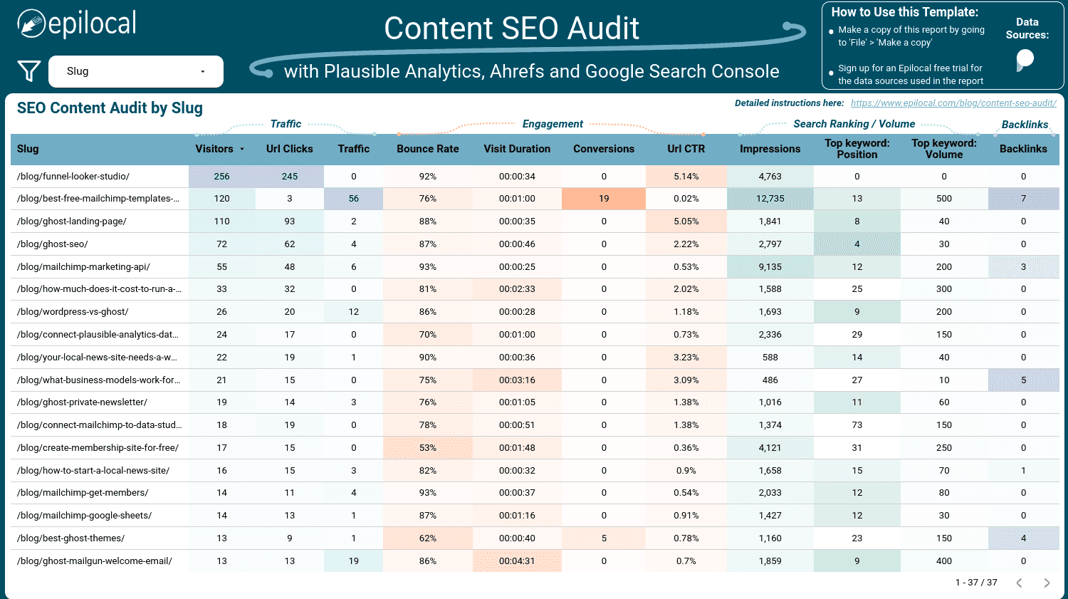
See how your content is engaging your readers. Here you can see your top posts not just in terms of views, but also in terms of reading time - and importantly, it is split between new and return visitors.
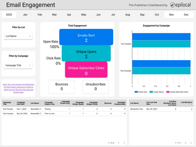
Email Engagement
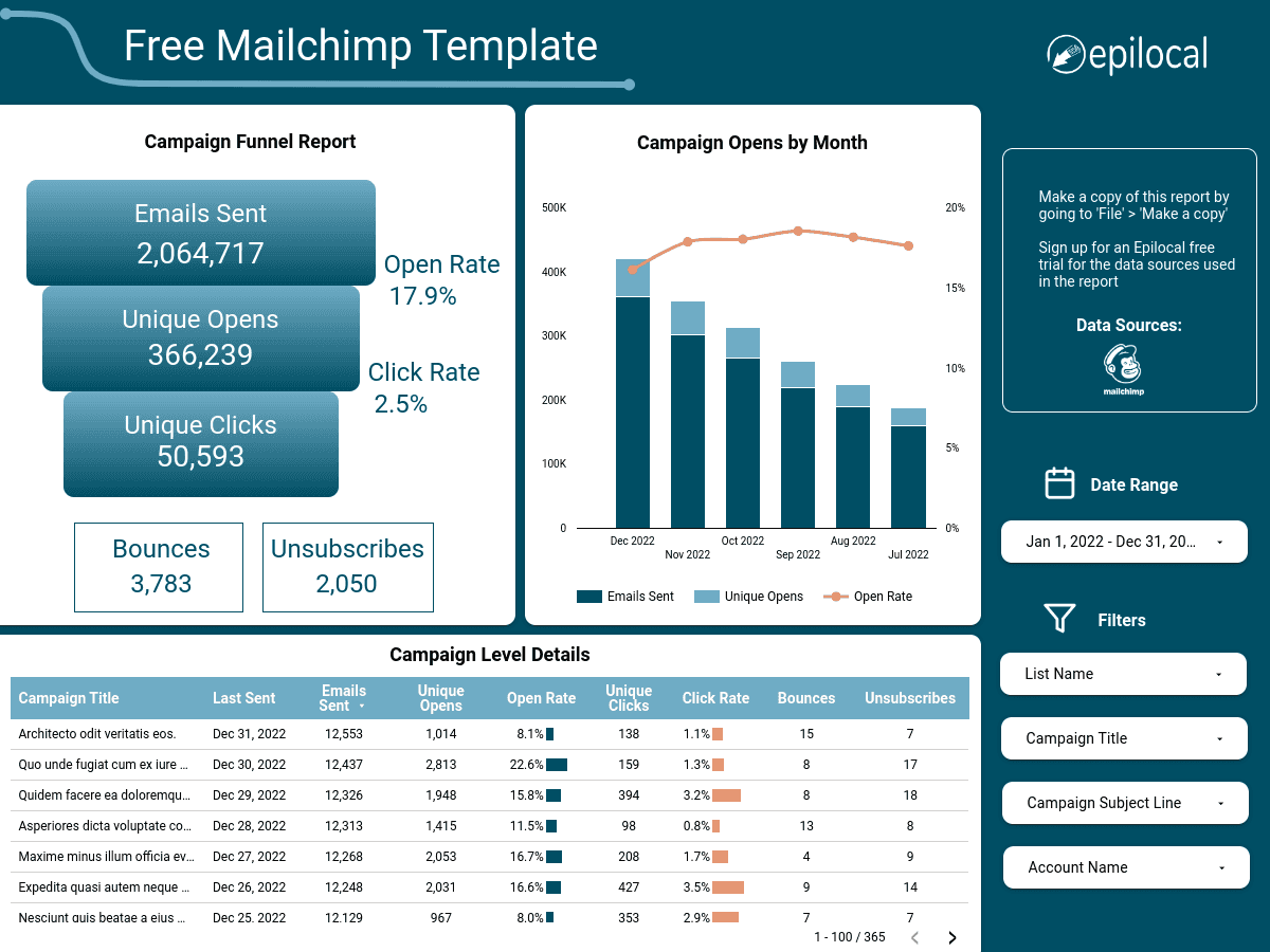
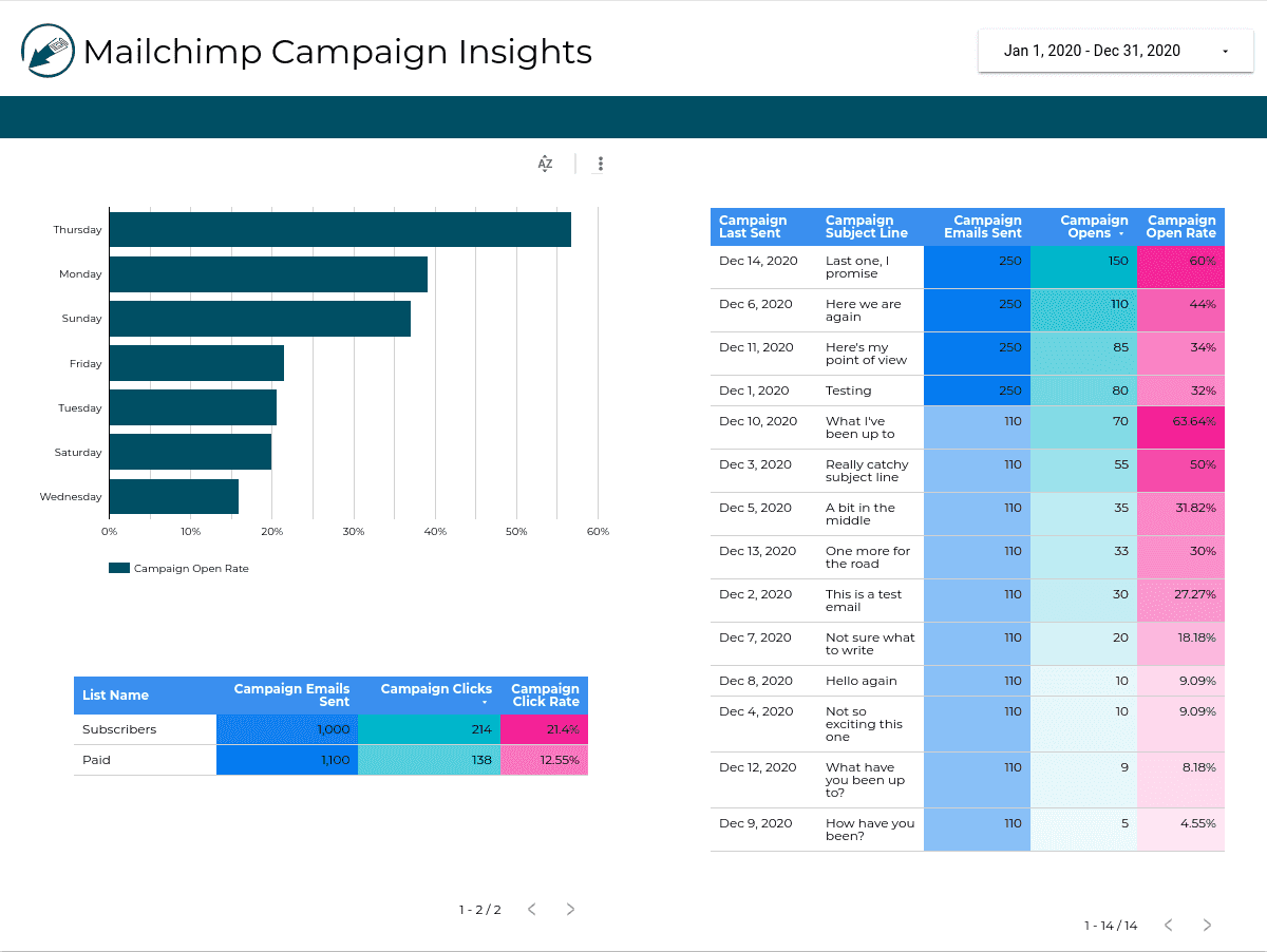
Quickly understand the performance of your email newsletters. You can see overall how many emails you are sending in a time period along with how many opens and clicks they are getting. At the same time, you can instantly see the same view split out by individual marketing campaign or newsletter.
Data in 1-2-3
Clicking the link above will take you directly to Looker Studio (formerly Google Data Studio) where you can explore the Publisher's Dashboard Template for Google Analytics further in Looker Studio.
Once you are in Looker Studio, you can make a copy of the Publisher's Dashboard report which will enable you to have Edit access.
Frequently Asked Questions
Yes - the link above takes you directly to Looker Studio where you can directly make a copy of the Publisher's Dashboard report. We made this Looker Studio template free as a way to draw attention to our data source connectors.
Formerly known as Data Studio, Looker Studio is a free data analysis and data visualization platform from Google. Using various data source connectors you can centralize all of your data into Looker Studio for one-off analysis or dashboards you can check in real-time.
Epilocal builds affordable tools to help small businesses centralize all of their data in one place using free tools like Looker Studio.
If you subscribe to one of our data source connectors, you will get priority email support. Otherwise, you are welcome leave a message on our Contact Us page where we will get back to you as soon as possible.

